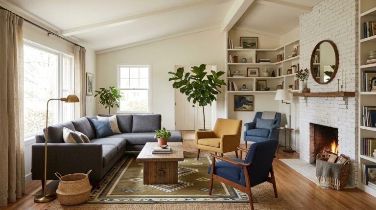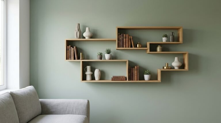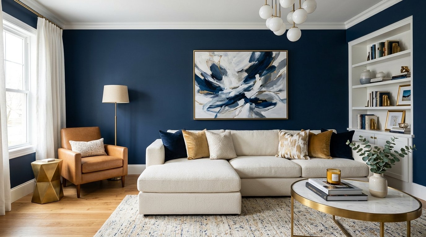
33 Living Room Color Schemes Designers Swear By
Introduction
Color is the single most transformative element in any living room. It sets the mood, defines the space, and tells the story of who you are. For designers, choosing the right palette is both an art and a science—a delicate balance of personal expression and timeless appeal.
Designers agree that a successful living room color scheme does more than just look good. It creates a feeling of warmth, encourages relaxation, and adapts to how you live. As interior designer Antoinette Allande Anderson puts it, “Nobody likes to hang out in a room with ugly wall colors”.
After years of pared-back color and quiet luxury, people are craving spaces that feel expressive and personal again. Designer Nadia Watts notes that “jewel tones instantly make a room feel more intimate and vibrant, which is exactly the mood so many of us are longing for”.
The beauty of living room design is that almost any color can work when you understand how to build a palette around it. From warm whites to rich jewel tones, the possibilities are endless. Here are 33 living room color schemes that interior designers return to again and again.
Timeless Neutral Foundations
1. Warm White and Soft Beige
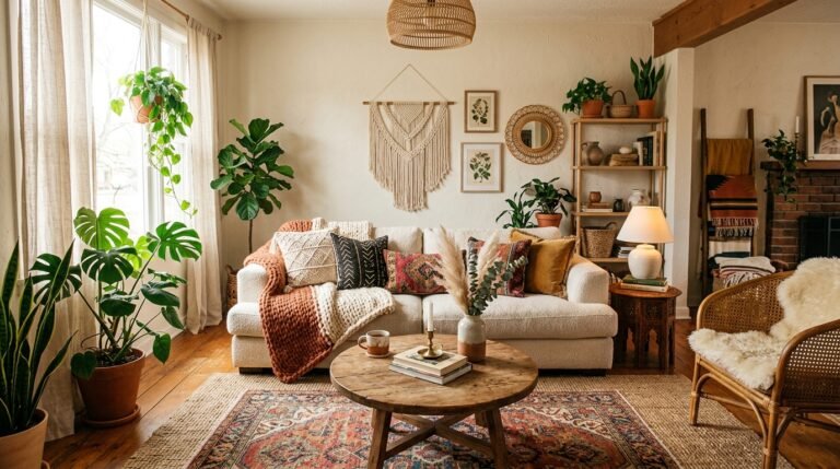
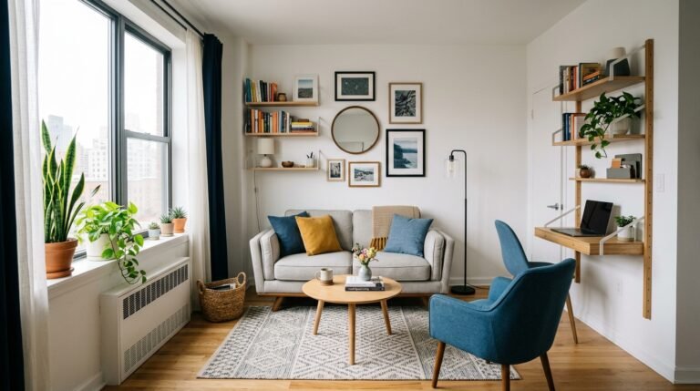
Warm white walls paired with soft beige furnishings create a foundation that feels calm, inviting, and endlessly adaptable. Designer Antonio DeLoatch consistently gravitates toward warm whites because of their “inviting, adaptable nature” and their ability to make a room feel “cozy and expansive all at once”.
Benjamin Moore’s Chantilly Lace has been cited by multiple designers as their go-to warm white. This versatile shade serves as the perfect canvas for showcasing artwork, statement furniture, or layered textiles. The result is a space that feels gallery-like yet warmly welcoming.
Sherwin-Williams’ Alabaster is another favorite for its soft, warm off-white quality that “adapts beautifully to different lighting conditions and creates a calm, inviting foundation without reading stark or cold”.
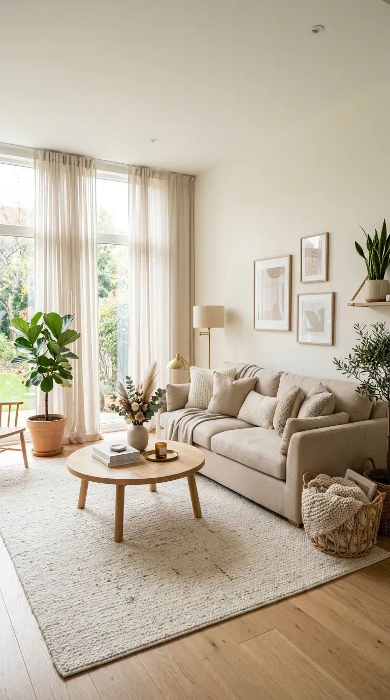
2. Monochrome Neutral Layering
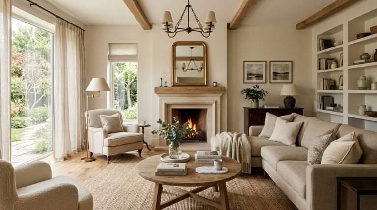
Layering different tones of cream, beige, and greige creates visual depth while maintaining a serene atmosphere. The key is varying textures—linen, wool, wood, and stone—to keep the palette from falling flat.
As creative stylist Julia Bilotta explains, “Texture is essential in a neutral space, as it stops serenity from slipping into sterility. Linen, wool, wood, rattan—these materials add detail without introducing clashing color”.
This approach ensures that even the simplest palette feels rich and layered. In monochrome neutrals, fabrics and carpets often work together to create a cohesive, calming environment.
3. Cream and Greige
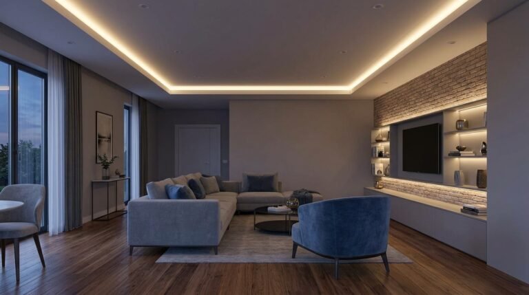
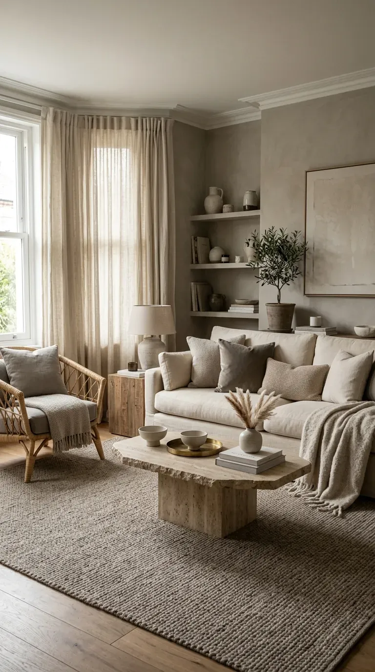
Greige—the perfect marriage of gray and beige—offers a sophisticated alternative to stark neutrals. Pair it with cream upholstery and dark wood accents for a look that feels both modern and timeless.
The subtle warmth in greige paint prevents the room from feeling chilly, while the gray undertones keep the aesthetic looking polished and current. This is an excellent choice for open-concept living areas where you want a consistent and calming backdrop.
4. Oyster White with Natural Light
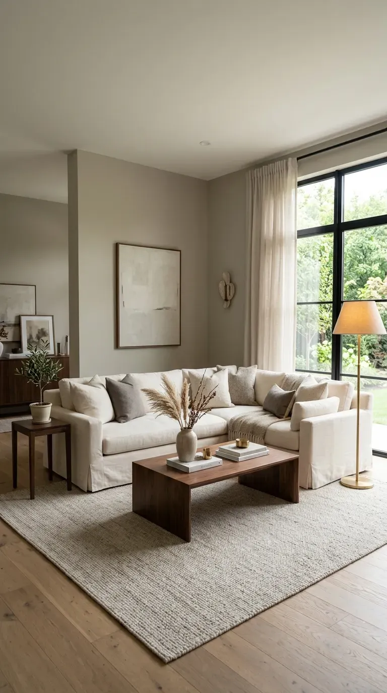
When natural light is the main character, a warm white paint color like Sherwin-Williams’ Oyster White becomes the perfect supporting actor. In sun-drenched spaces, these walls seem to capture the golden hour, creating a warm, glowing atmosphere.
This shade works particularly well in rooms with abundant windows. The warm undertones interact beautifully with changing natural light throughout the day, making the room feel alive and dynamic.
5. Gray-Beige and Soft Textiles
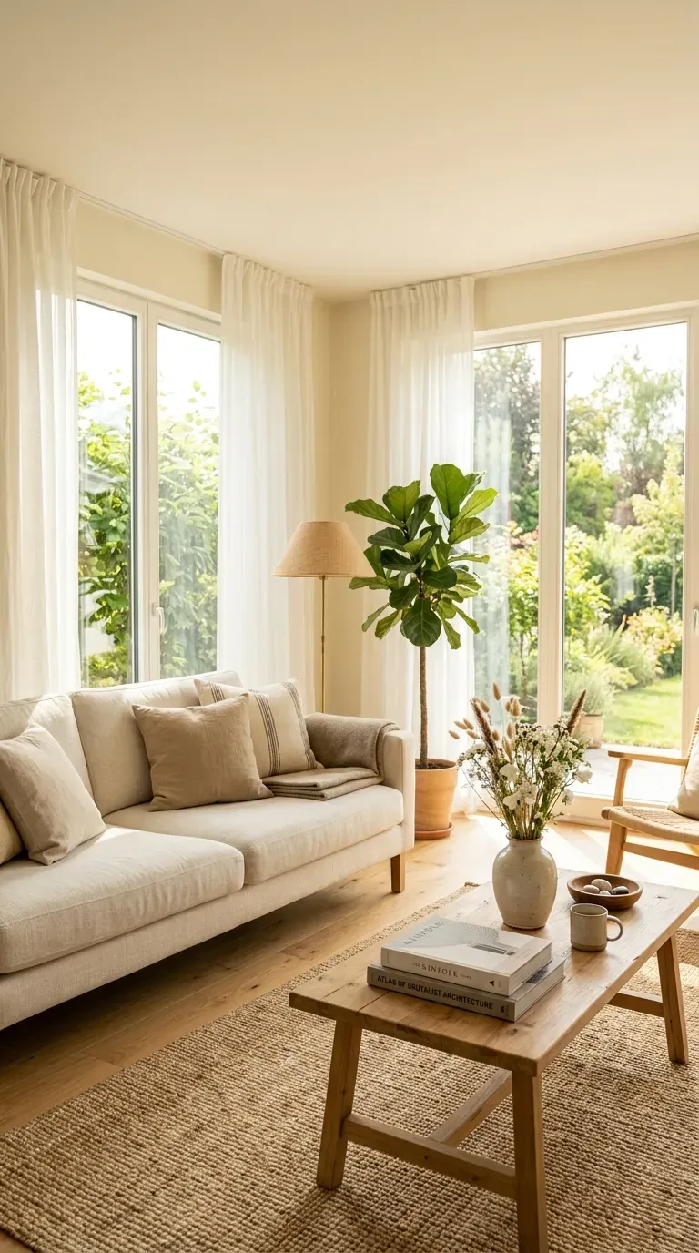
A warm gray-beige hue provides a fresh backdrop for a mix of antiques and soft textiles. Benjamin Moore’s Grant Beige is a designer favorite for creating a gracious sanctuary that feels both timeless and inviting.
This versatile neutral pairs beautifully with patterned pillows and upholstery. The soft warmth of the walls allows furniture and accessories to shine without competing for attention.
Green and Earthy Tones
6. Rich Olive Green
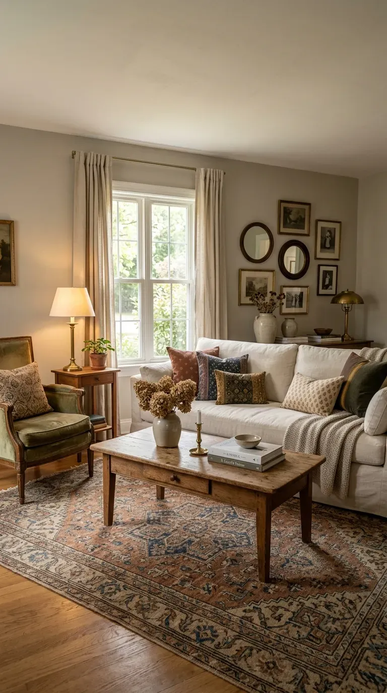
Rich olive green has become a designer favorite for 2026. Designer Jessica Hobson calls it her “hands down” favorite living room color, describing it as “not easy to find a grounding neutral that isn’t boring, but this is definitely it: interesting and soothing”.
Olive green feels cozy in winter and comes to life in spring and fall. Benjamin Moore’s Gloucester Sage and Farrow & Ball’s Bancha are top choices for this muddy, earthy green. The warmth of the color pairs beautifully with brass accents and works as “a great backdrop for artwork, allowing it to pop off the wall”.
Designers also love pairing olive green with pops of plum, pink, or pale blue for added dimension.
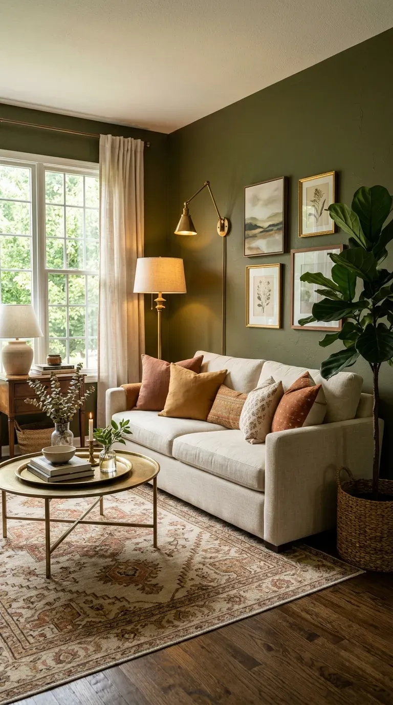
7. Muddy Green with Brass
Muddy, earthy greens are replacing forest greens as the stylish way to embrace green living rooms. These shades feel “cozy in the winter and come to life in the spring and fall,” while also playing well with pops of plum, pink, or pale blue.
Brass accents play into the warmth of these colors, making the space feel grounded and luxurious. Benjamin Moore’s Gloucester Sage and Farrow & Ball’s Bancha are recommended for their versatile, grounding quality.
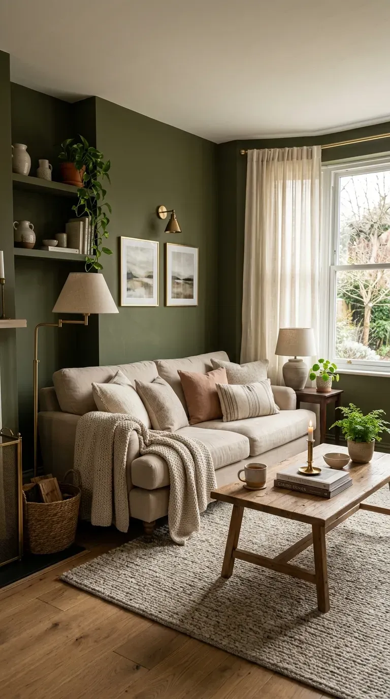
8. Sage Green with Warm Neutrals
Sage green offers a softer approach to green living rooms. Backdrop’s Saged is a favorite for its muted quality that serves as a “neutral but not white” option—perfect for families who want color without the maintenance of white walls.
When paired with warm neutrals like cream, beige, and natural wood, sage green creates a space that feels tranquil and grounded. This palette works beautifully in both modern and traditional settings.
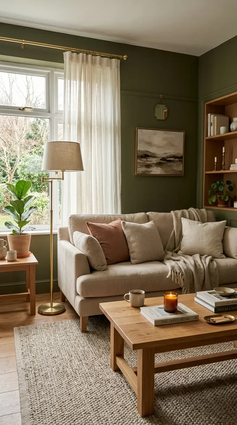
9. Wasabi Green Statement
For those who want to bring the outside in, wasabi green makes a bold statement. Designer Colette van den Thillart covered the walls of a Toronto home in Wasabi by Para Paints, creating a space that feels “fresh, vital, and connected to nature”.
This vibrant green works best in spaces with plenty of natural light and is balanced by neutral furnishings and natural textures. The result is energizing yet sophisticated.
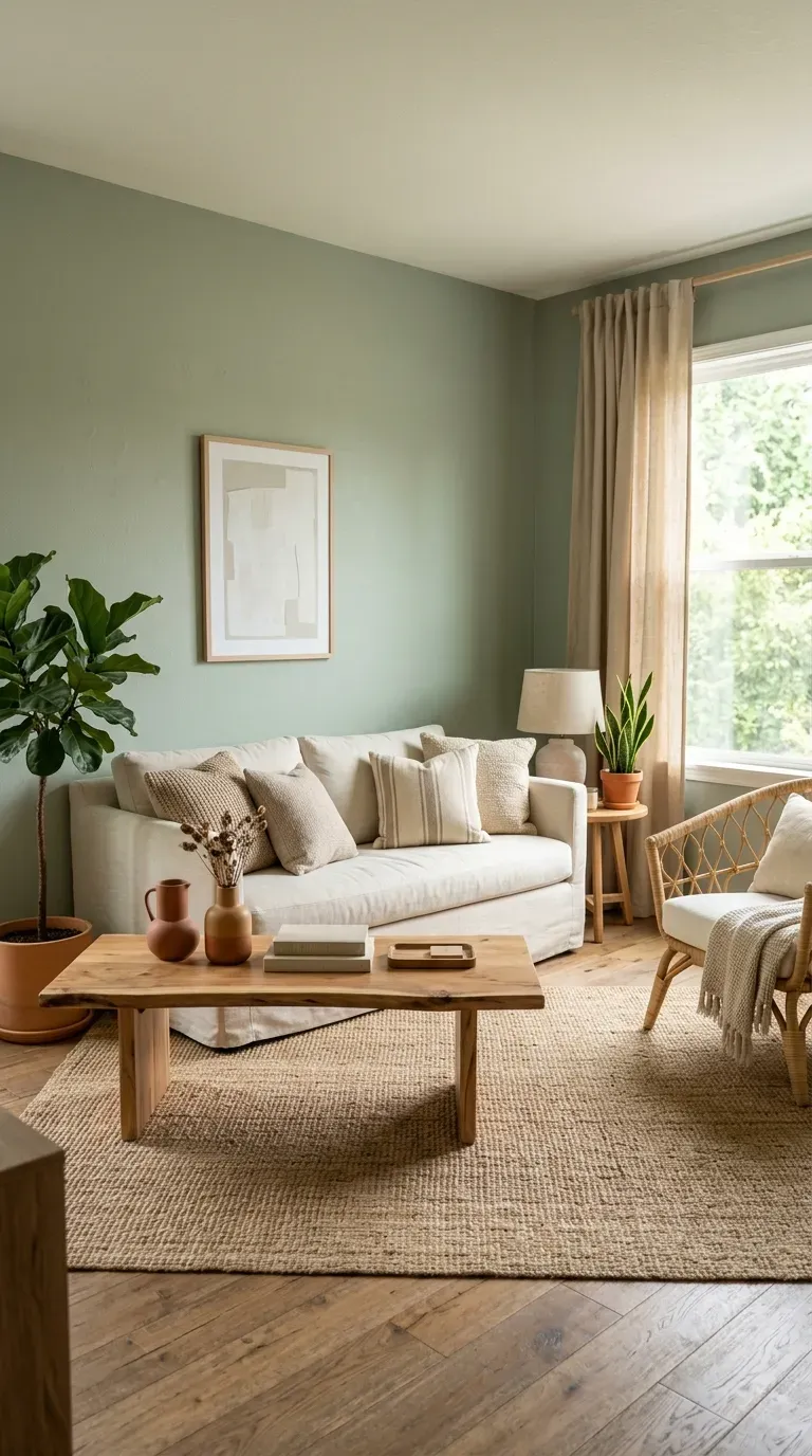
10. Deep Green and Plum
For dramatic depth, pair deep green walls with plum accents. In an Upper East Side townhome, designer Lucy Doswell used a tufted deep plum corner banquette against a graphic mossy light green wallcovering.
The combination of plum and mossy green creates a rich, moody atmosphere that feels both luxurious and grounded. Light-colored furniture and metallic accents help balance the intensity of the palette.
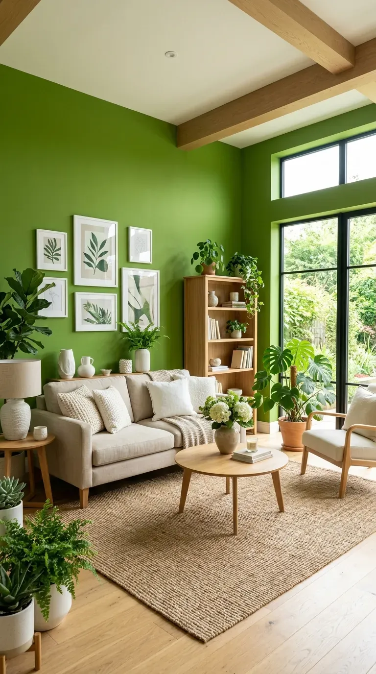
11. Mossy Green with Jewel Tones
Designer Serena Dugan chose the serene hue Raindance by Benjamin Moore for her living room. This chameleon-like gray-green color is “supremely flexible” and can come off colder or warmer depending on the furniture and decor you finish the rest of the room with.
Designer Amber Lewis notes that sometimes you can’t judge a paint color by its swatch. Her mossy green tone “when the entire room is that color, it’s really lovely”.
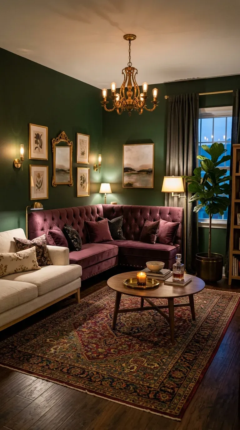
12. Olive, Blood Orange, and Dusty Blue
Olive lacquered walls provide a delicious backdrop to an eye-catching side chair dressed in a blood orange mohair. This Summer Thornton-designed sitting room shows how vivacious shades can balance frilly, traditional fabrics.
The combination of earthy olive with vibrant blood orange and cool dusty blue creates a dynamic yet harmonious palette. This scheme proves that green can serve as a stunning neutral foundation for bolder accent colors.
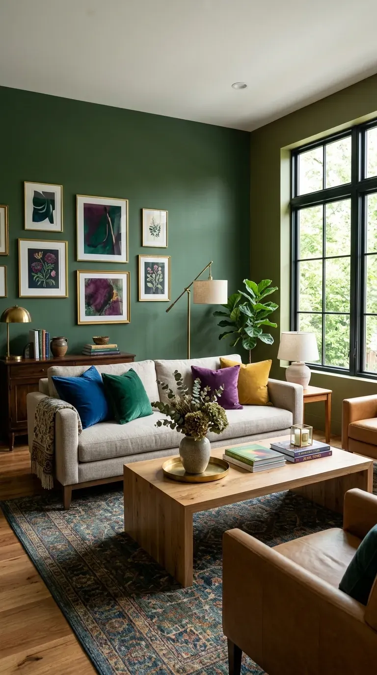
Blue and Blue-Green Hues
13. Muted Teal
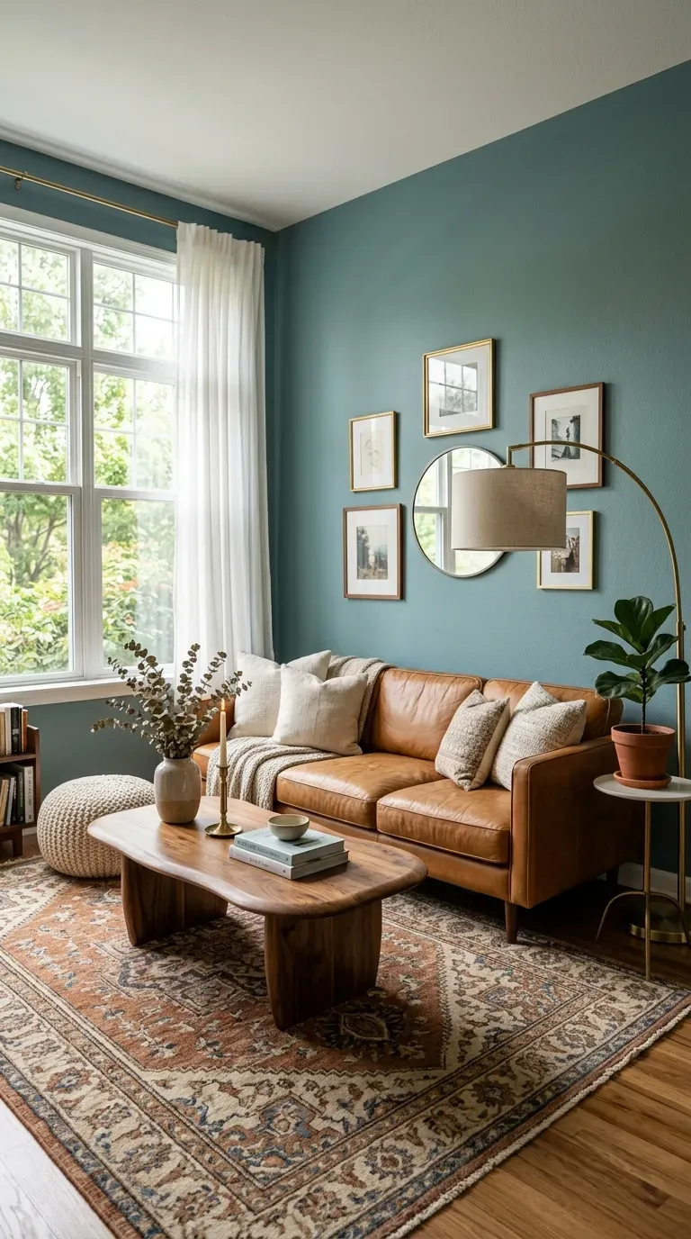
Teal has been getting significant attention in 2026, offering a gorgeous, serene living room color that bridges the gap between blue and green. Designer Michelle Gage loves Benjamin Moore’s Atmospheric on walls, calling it “an excellent backdrop to layer great pattern and color into the room”.
Gage also recommends Farrow & Ball’s Dix Blue, describing it as “a great color on its own, but even better when you layer rich emeralds, warm caramels, and soothing pinks on top of it”.
Teal paints with a dose of gray are versatile enough to layer with plenty of other colors, making them feel livable and sophisticated.
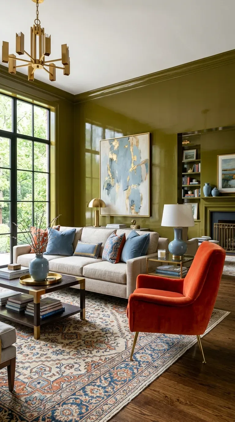
14. Harbor Haze Blue
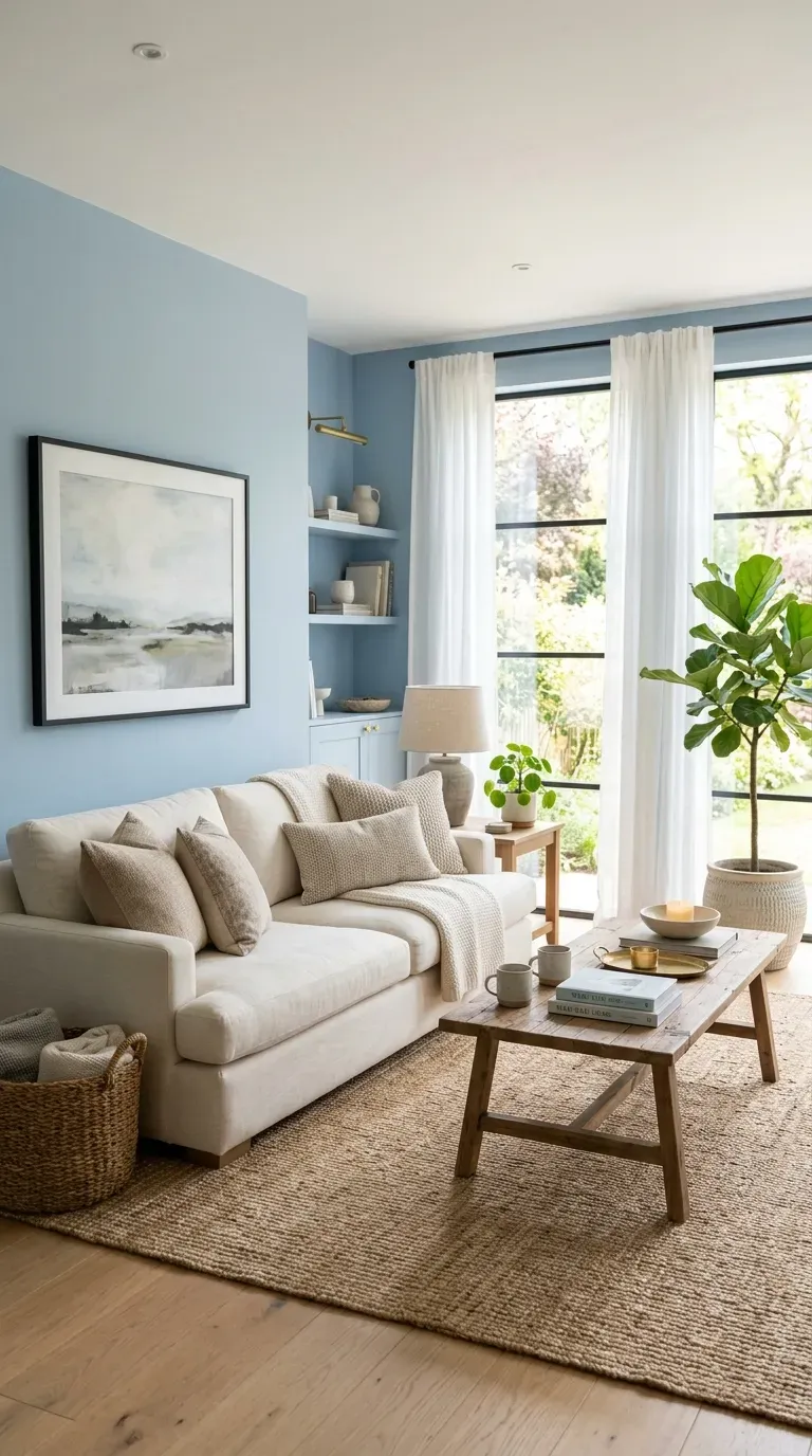
In a prewar duplex apartment in Harlem, designer Rayman Boozer used Benjamin Moore’s Harbor Haze on the walls—a shade described as “bright enough to lift your spirits, and soft enough to let you relax”.
This versatile blue works beautifully in both traditional and contemporary settings, providing just enough color to feel intentional without overwhelming the space. It’s the perfect choice for those wanting a soft, calming blue.
15. Blue-Green with Walnut
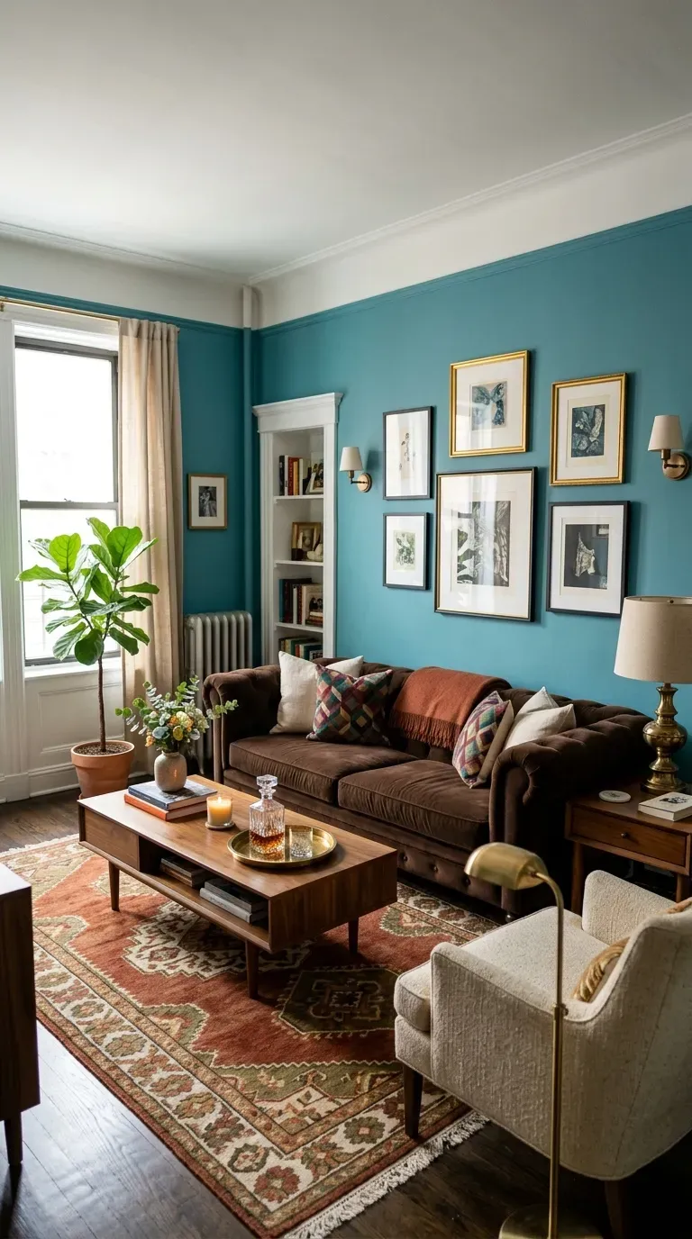
Designer Meredith Ellis intentionally selected a blue-green shade for her Manhattan living room to bring a “happy” color into the petite apartment. The dark walnut-brown cotton velvet on the sofa brings in a sense of formality reminiscent of old-school New York interiors.
This combination of cheerful blue-green walls and rich walnut upholstery creates a space that feels both joyful and grounded. The contrast between cool walls and warm wood tones adds sophistication.
16. Soft Sky Blue
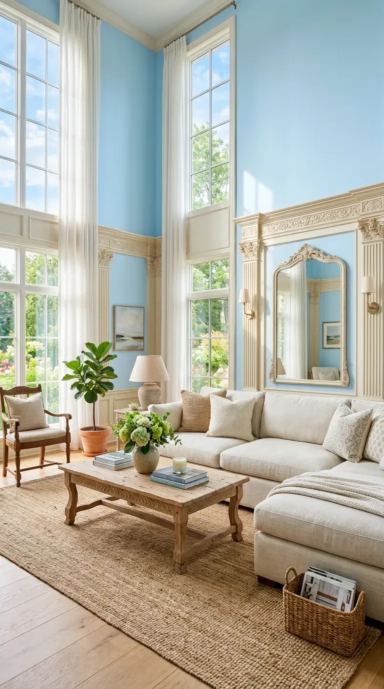
Dreamy light blue hues reflect the clear skies outside and create an airy, open feel. Designer Timothy Corrigan used Benjamin Moore’s Harbor Fog on the walls to offset warm white carved oak paneling and pilasters.
Soft sky blue creates a calming atmosphere that works beautifully in both traditional and contemporary spaces. The hue transitions effortlessly from day to night, appearing bright during daylight hours and taking on a moodier tone in the evening.
17. Blue, White, and Wood
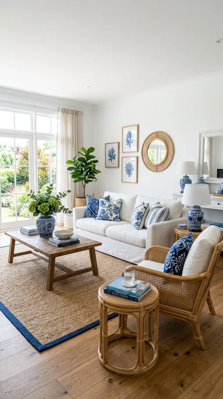
Inspired by classic porcelain patterns, this palette combines crisp blue and white with warm cane and rattan furnishings. Decorator Philip Vergeylen used this approach at a home in Casa de Campo, covering furnishings with batik throws and pillows for a collected, global feel.
The combination feels timeless and breezy, perfect for coastal-inspired homes or anyone seeking a fresh, clean aesthetic. The natural wood elements add warmth that balances the cool blue tones.
18. Inky Blue and Pattern
The solid blue wall in designer Heather French’s living room anchors a heavily patterned space. The deep blue is Admiral Blue by Benjamin Moore, and it looks almost electric when put alongside a plethora of patterns.
Inky blue works beautifully as a backdrop for patterned textiles and artwork. The depth of the color prevents the space from feeling too busy while allowing decorative elements to shine.
19. Slate Blue Ceiling
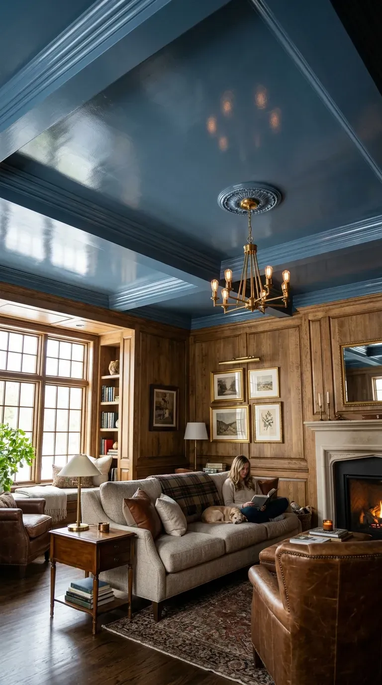
When selecting a living room paint color, remember that you don’t have to paint just the walls. Designer Suzanne Kasler chose a glossy slate blue—Providence Blue by Benjamin Moore—for the ceiling in a cozy wood-paneled room.
This unexpected approach differentiates the space and draws the eye upward, creating a dramatic and sophisticated effect. The glossy finish reflects light and adds dimension.
Warm and Earthy Browns
20. Walnut Brown with Cream
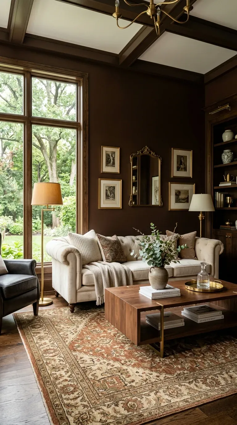
Brown is making a significant comeback in 2026. Designer Beth Diana Smith used Benjamin Moore’s Walnut on the walls of a living room, bringing “sophisticated depth” that proves brown is anything but boring.
Walnut brown pairs beautifully with cream upholstery, creating a warm, grounded space that feels both traditional and fresh. As designers note, brown “goes with almost anything and is a very good neutral overall”.
21. Rich Chocolate Brown
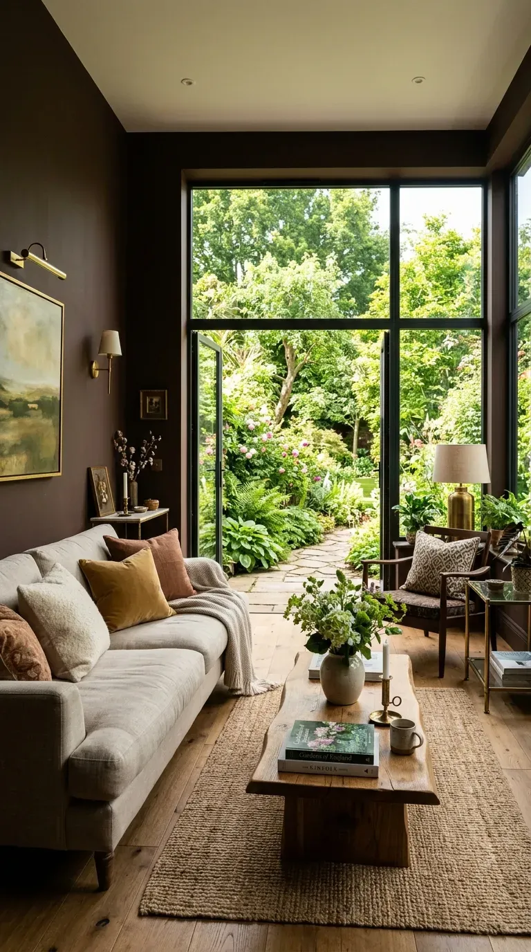
Matthew Carter cleverly selected a dark hue for the walls of a Maine living room to enhance the natural light pouring in from the windows. He explains, “A deep color lets the walls recede and the windows expose the garden beyond”.
Rich chocolate brown creates a cocooning atmosphere that feels intimate and luxurious. When paired with ample natural light, the dark walls recede and make the space feel more expansive.
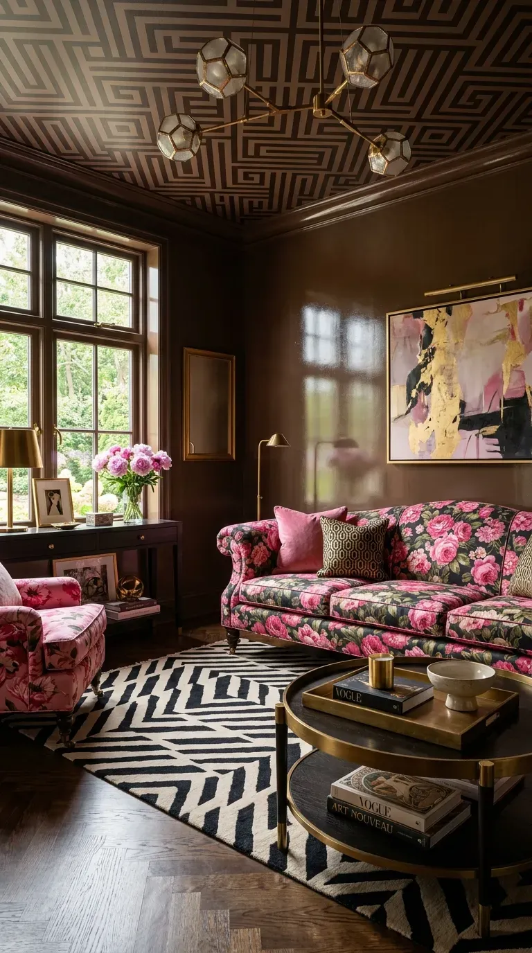
22. Coffee Brown and Electric Pink
Glossy brown walls and gutsy pink florals dial up the drama in this Richmond living room designed by Suzanne Kasler. A geometric rug and graphic ceiling act as modern counterpoints to the more traditional upholstery fabric.
This daring combination shows that even the most unexpected color pairings can work beautifully when executed with confidence. The brown provides a sophisticated anchor for the vibrant pink accents.
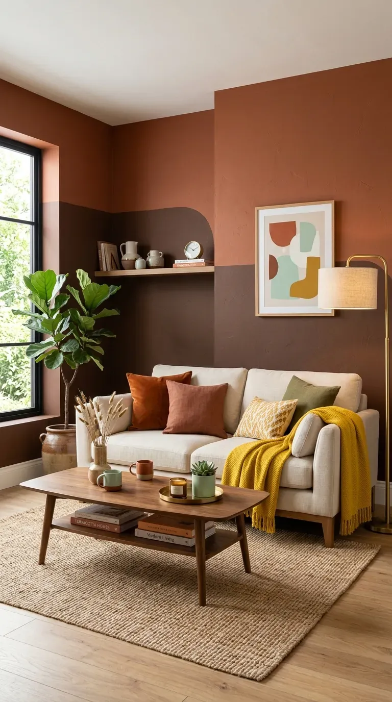
23. Color-Blocked Browns
Rather than all-over room drenchings, designers are embracing color-blocked browns that play with the color’s tonality. This approach combines rich hues like terracotta or chocolate with lighter palettes to create warm contrast.
Familial—or contrasting—colors in the rest of the room keep it feeling cozy. “Browns, reds, and aubergines with complements of a citrine or mint are very popular”.
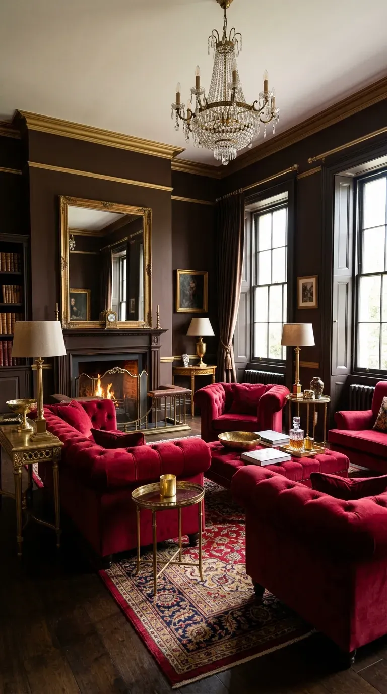
24. Ruby and Deep Chocolate
Designers Andrew Fisher and Jeffry Weisman leaned into a ruby red palette for their Mexico City condo, drawing inspiration from a painting. The hue appears on both the rug and velvet-wrapped sofas, while chocolate brown walls create a “sophisticated border to the sea of fiery tones”.
This rich, dramatic palette is perfect for those who want their living room to make a bold statement. The combination of ruby and deep chocolate feels luxurious and intimate.
Pink and Blush Tones
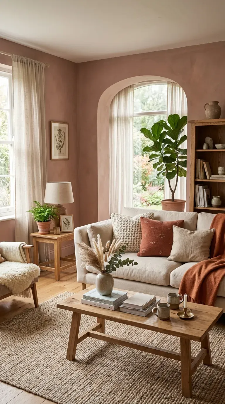
25. Dusky Pink
Warm, pinky-neutral colors are trending in 2026 as people seek expressive, personal spaces. Designer Marie Flanigan notes that for 2026, “living room colors are moving toward warm, nuanced shades that feel both timeless and inviting”.
Farrow & Ball’s Dead Salmon is a favorite for its “unexpected yet still functions as a neutral” quality. Its “soft blend of pink, brown, and earth tones adds warmth without overwhelming a space”. The color pairs beautifully with natural materials like wood, linen, and stone.
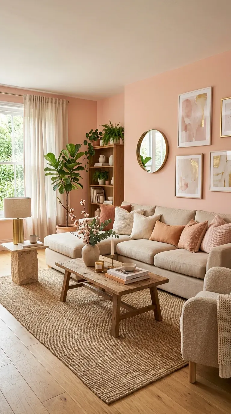
26. Peach Blossom Pink
Peach blossom pink adds subtle glam to any living space. Architect Carmel Greer used Benjamin Moore’s Peach Blossom in her Washington, D.C., family home, creating a room that feels soft and sophisticated.
When paired with natural materials like wood, linen, and stone, this peachy pink creates a “relaxed, collected feeling.” It’s an ideal choice for anyone wanting character and depth while keeping the living room highly livable.
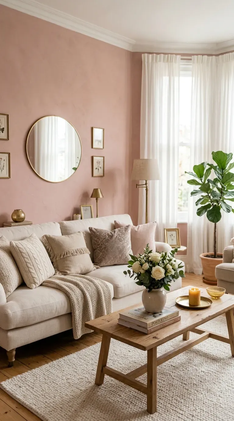
27. Portofino Pink
Portofino Pink by Portola Paints offers the perfect blend of romance, sophistication, and calm. Used by designer Tiffany Howell in a “Rosé room,” this soft blush creates a dreamy atmosphere that feels both intimate and uplifting.
This shade works beautifully in spaces where you want to create a sense of romance and tranquility. The soft pink hue feels sophisticated rather than sweet.
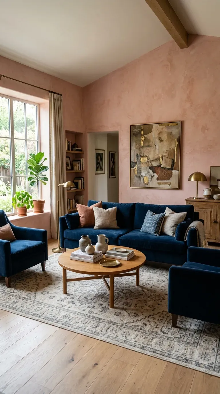
28. Sunbaked Pink and Midnight
Rosy plaster awakens the walls of a gently restored sala at Laura Kirar’s Mexico hacienda. A mix of seating, all designed by Kirar, boasts a deep midnight hue that keeps the soft pink color from feeling too sweet and adds definition to the room.
This combination of warm pink and deep midnight creates a balanced, sophisticated palette. The dark accents ground the space while the pink adds warmth and personality.
Vibrant and Bold Statements
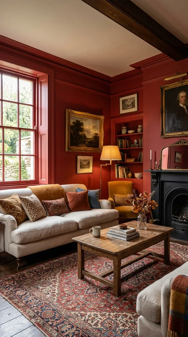
29. Rectory Red
Color-drenching a room in red is a daring but rewarding choice. The lounge area of a New York City home doused in Farrow & Ball’s Rectory Red is described as “utterly enchanting”.
Red creates an intimate, cocooning atmosphere that works well in formal living rooms or spaces meant for entertaining. Balance the intensity with warm neutrals in furniture and accessories for a harmonious look.
30. Pea Green and Poppy Reds
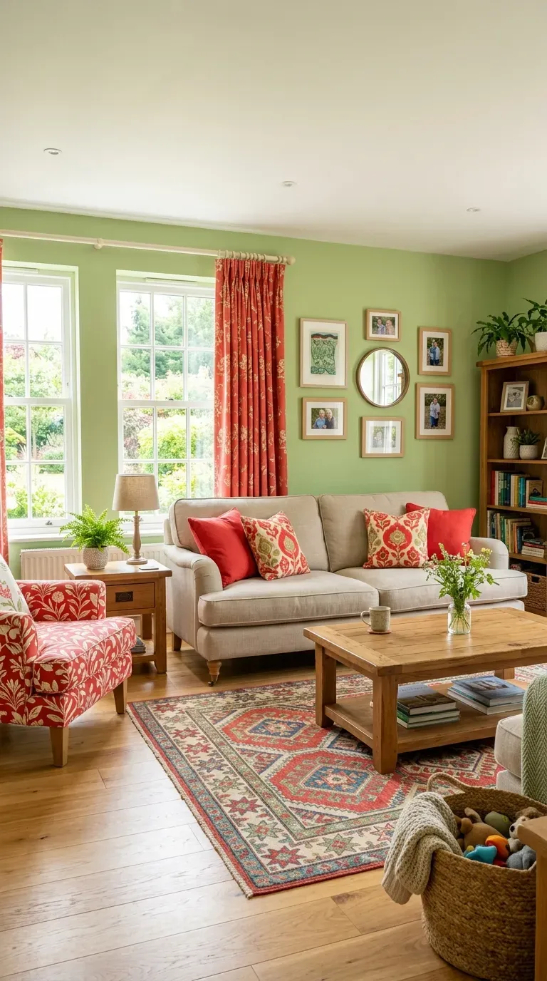
Wallpaper designer Mia Reay transformed a once-somber hall into a family hub by dousing the walls in a spring green hue (Farrow & Ball’s Pea Green). Bursts of poppy red on the curtains, rug, and seating further add a lightness to the room.
This cheerful combination proves that green and red can work together without feeling too festive when using muted, earthy versions of both colors.
31. Chartreuse with Camel and Purple
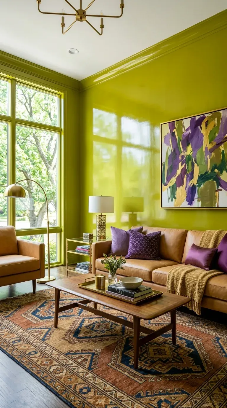
High-gloss chartreuse walls create an electric atmosphere in Chairish cofounder Anna Brockway’s Upper East Side apartment. This “gutsy hue reflects the green of the trees outside the window,” while subtle shades of purple and camel in the upholstery provide grounding.
This vibrant palette is perfect for those who want their living room to feel energetic and alive. The high-gloss finish adds another layer of drama and sophistication.
32. Emerald Green with Gold
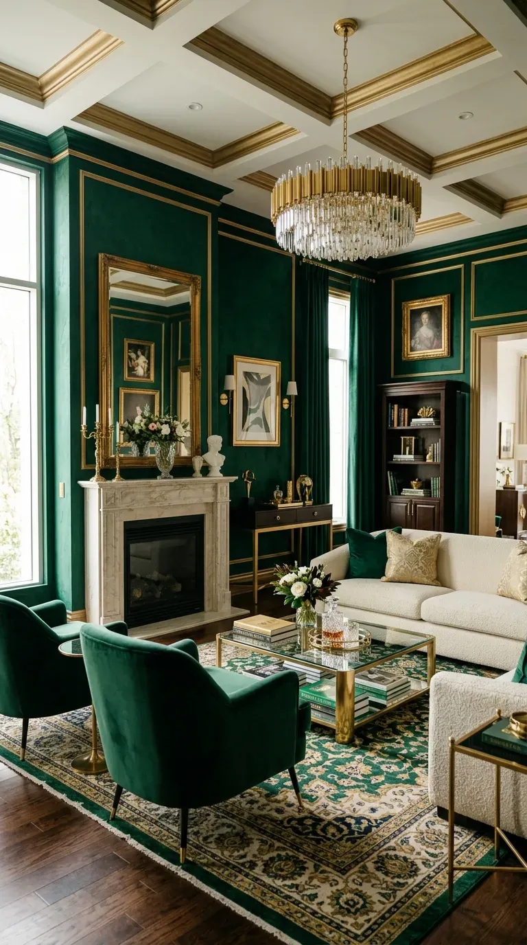
For a luxurious take on living room color, mix deep emerald green with gold accents. This palette “ties in with the emerald wall paint, creating a rich, jewel-toned harmony” where “the repetition of colors creates a visual rhythm and pulls the gaze through the room”.
This combination is part of a larger trend of country “going luxe” with “more over-the-top and extra comfy” design. The emerald and gold palette feels both timeless and thoroughly modern.
33. Burnt Red and Light Yellow
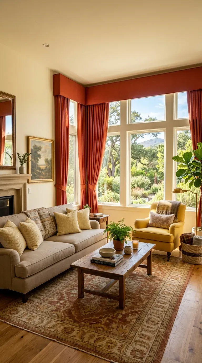
The pelmet and drapery fabric in a burnt orange-red color surrounds a wall of windows in designer Palmer Weiss’s California home, with yellow pillows and a chair accenting its color scheme.
This warm, inviting palette creates a cozy atmosphere that feels both sophisticated and approachable. The combination of burnt red and light yellow adds warmth and visual interest without feeling overwhelming.
Conclusion
The 33 living room color schemes designers swear by prove that there’s no single “right” choice—only what works for your space, your lifestyle, and your personal taste. From timeless warm whites to bold jewel tones, each palette offers a distinct mood and character.
What makes these schemes designer-approved is their versatility and ability to create emotional connection. Whether you choose olive green with brass accents, navy with warm caramel, or a sophisticated neutral palette, the key is thoughtful layering.
Before committing to any palette, test your paint samples at different times of day. Natural and artificial light can dramatically change how a color appears. The shade that looks perfect at noon might feel entirely different in evening lamplight.
Ultimately, your living room should be a reflection of how you want to feel and how you spend your time. “If you want people to get very cozy and comfortable, you may opt for a darker wall color. However, if the space is more formal, using a light paint color might be more appropriate. You need to choose the color to help achieve the desired feeling in the space”.
Whether you’re drawn to the grounding warmth of earthy tones, the serene calm of soft blues, or the dramatic allure of jewel-toned statements, these 33 designer-approved schemes provide the inspiration you need to transform your living room into a space that’s beautiful, functional, and uniquely you.